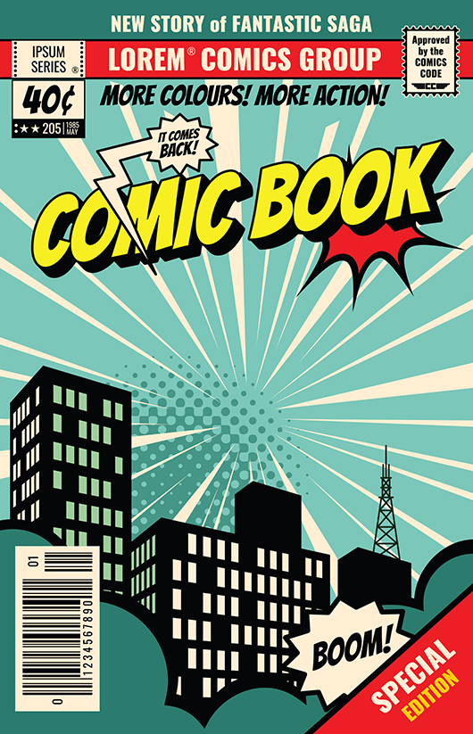
How to Make a Comic Book Cover
July 17, 2020
The adage says that you shouldn't judge a book by its cover, but that's not necessarily the case if you're creating a graphic novel. Covers are one of the most visible and essential pieces of your creation.
The cover is a distillation of your characters and your plot, and it is also the primary way potential readers encounter your book. The cover is what they see first, and you want to make a good impression.
Arguably, designing a comic book cover is the most crucial step in the creative process. The cover is the first thing that potential readers see. If you've read some graphic novels yourself, and you probably have if you plan on writing one, then you know how eye-catching and show-stopping a cover can be.
You don't have to be an expert in graphic design to create a comic book cover, although knowing some basics help. Here are some pointers on what to put on your cover and why.
Put Your Main Character Front and Center
You can put anything you like on your cover. However, an experienced comic book artist will tell you that you should consider putting your main character on the front.
Most narratives only have one main character, even if it's the most modern, cutting edge writing. It makes sense to feature your protagonist on the cover because it lets readers know who's story they'll be following.
Since a lot more time and space is spent on the cover of a graphic novel, it gives you a reason and some room to splash out on a depiction of your main character. In vibrant, eye-catching colors, a cover is a beautiful place to showcase your character.
Alternatively, some comic book writers put other characters on the cover. Some choose the main villain or archenemy, or a character who has a unique role to play in the story.
If you opt for a character other than your star, make sure the scene and characters you do showcase interplay substantially with your protagonist. For example, if the daughter of one of your characters is kidnapped early on, you can put her on the cover, and it will still relate to your plot.
What you want to be wary of is picking a character or scene with little to do with your protagonist or plot. You don't want your reader to feel like they're reading a completely different story than what they initially picked up.
Choose Colors Carefully
Some simple color theory rules can help guide your choice. In reality, you don't have to use any colors at all. There are some beautiful black and white covers.
In a broad sense, darker colors convey evil or suspense. Pastel colors infer buoyancy, love, and joy. Bright colors connote friendship and adventure.
Bright colors catch a reader's eye but don't use too many at once, or your cover may be too loud and busy. Monochromatic or subtly shaded covers can have a lot of impact, and you can make a substantial impact with negative space.
Pick a Moment of Action
Covers often hint at the action inside the graphic novel, and it's a delicate balance of sharing just enough or giving it all away.
One way to pick a scene that would work well on the cover is to identify your story's climax as you work through your rough draft. Once you know what that climax is, consider the moments directly before it, when peril is at its height. Whatever this scene is, it may be worth gracing your cover.
You may steer away from an action scene and opt for a full-length or portrait style rendering of your main character. Whatever you choose, remember that the cover is a glimpse into the world of the comic. Make it inviting so your readers want to come in.

In Sum
The cover of your comic is a work of art, but it's also so much more. It's a snapshot into the plot arc of the story and a showcase of whichever character you choose to put on it.
At Comix Well Spring, we guide you through the publishing process, freeing you to concentrate on more creative ventures. By offering an array of style choices, including paper type, ink and coloring options, and the number of copies, your comic book is fully customizable.


